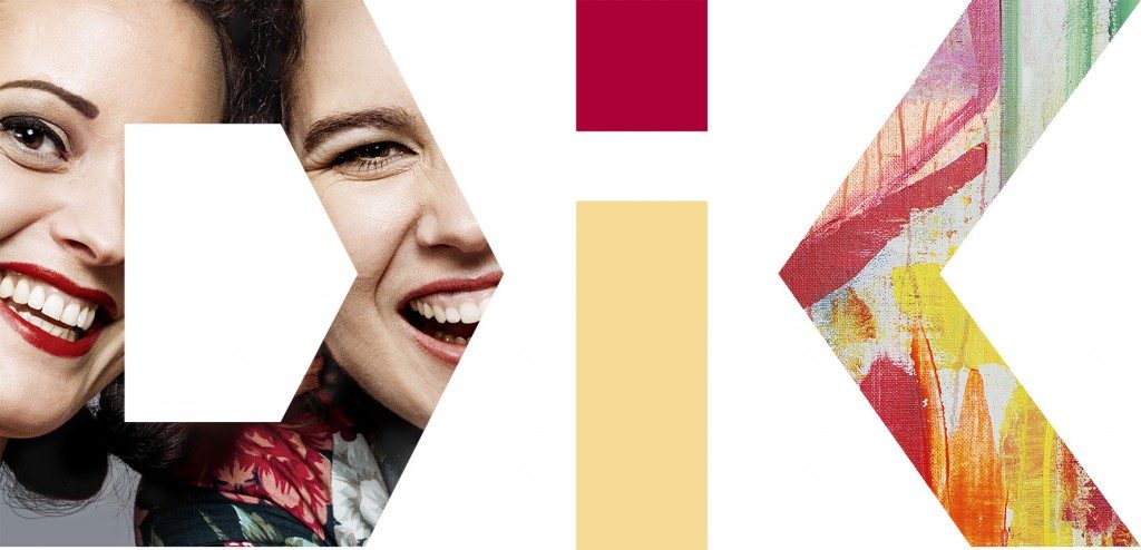
Anders Regnell, you are acting communications manager at DIK, the union for culture and communication. As of September your organization has been using a cutout from one of Katarina Nilssons paintings in your new logotype. Tell us a little about how that came about.
”The common denominator for all of the members in our union is that they all do creative work in one way or another. When we updated our graphical profile, and decided to use pictures, it felt natural for us to select images that would symbolize our members. We used a photograph of two of our members for the letter D and we wanted something that would create an association to culture in the last letter.”
How did you reach the decision that you were going to use Katarina Nilsson’s art?
”When we started talking about using some kind of a pattern for the letter K someone suggested that Katarina’s art might be suitable. We visited her webpage, looked through her selection and concluded that it was a good match. Our graphical designer Kajsen Burell made a number of cutouts for us to chose between and we finally decided on a piece of the painting ”Sparkling”.
Are you happy with your new logotype?
”Absolutely. We really like the way it looks and think that it conveys just the right feeling. We are also about to change offices and we hope that there will be room in the new premises for us to buy and hang the painting there.”
This is DIK’s new logo:
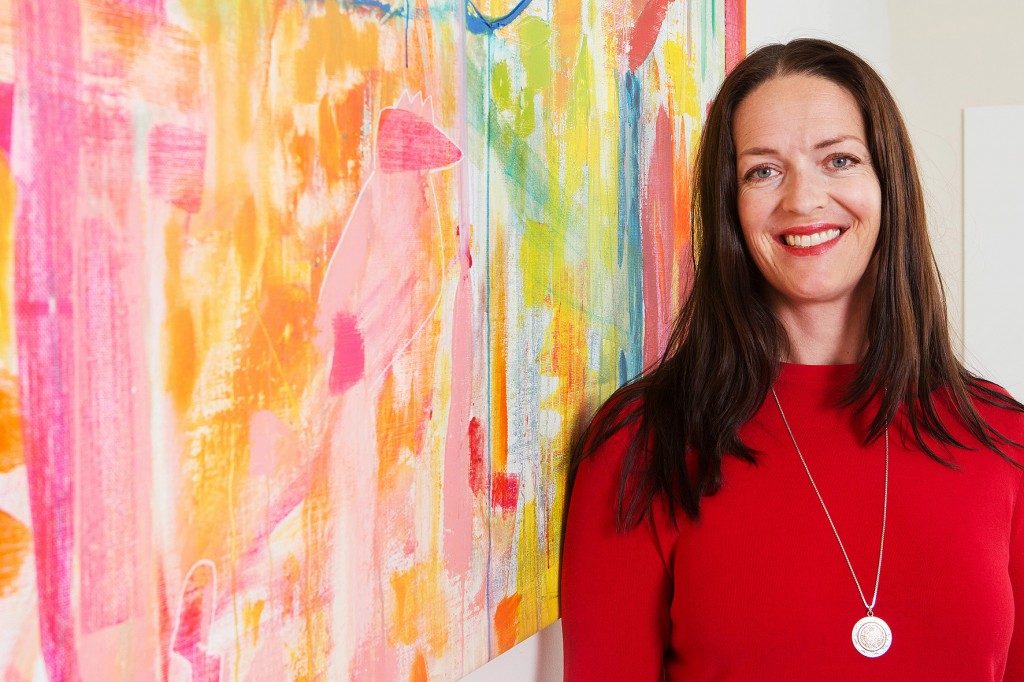
…and this is Katarina next to “Sparkling”.